In Conversation With: Mylands
 Restoring and decorating a period property comes with its own unique challenges. It often requires a careful balance between celebrating the heritage and history of the home and introducing modern refinements. We sat down with Dominic Myland, CEO of Mylands, to hear from an expert on how to decorate your period home.
From preserving ornate details and managing the quirks of older properties – such as tackling those uneven surfaces – to learning about the latest trends, this conversation sheds a light on all things period property redecoration.
Established in 1884, Mylands is Britain’s oldest family-owned paint and polish manufacturer. With a royal warrant, they have earned themselves an esteemed reputation for their commitment to quality and craftsmanship.
Hi Dominic. To kick off, please can you talk us through the process of selecting the right paint for a period property? How do you balance preserving the character of a historic property while still offering a fresh, updated look through paint?
Homeowners can pay tribute to a home’s past by choosing palettes that resonate with its history, such as muted tones or opulent earthy shades,which evoke a sense of timeless elegance.
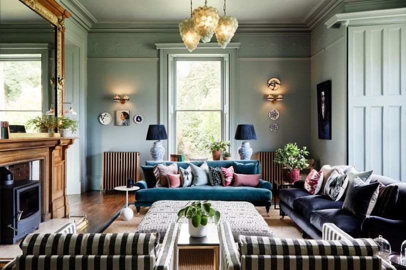
This doesn’t mean you always have to stick to the classics though. It’s possible to add a more contemporary twist, for example, by injecting a sophisticated blue hue - like Burlington Arcade No.216 - which adds a slightly more vibrant perspective without compromising the property’s character. Regardless of the colour you choose, it’s essential to test paint samples in-situ so you can observe the shade under varying light conditions throughout the day.
")
Burlington Arcade No.216 (Walls & Woodwork)
What role does colour play in a period property’s restoration? Are there specific historical colour palettes you draw inspiration from when working on a renovation project?
Colour plays a crucial role in the restoration of period properties. It acts as a powerful storytelling tool that preserves the architectural authenticity of the home, while subtly reinterpreting its grandeur for modern living. By carefully selecting shades that reflect the original aesthetic, homeowners can maintain the character and historical integrity of the space, ensuring the property’s rich heritage is honoured while bridging the past with the present. The palette will always depend on the property’s architectural style and age, but as an example, Enamel Blue No.78 is a shade in our Archive collection, and it evokes the deep, luxuriously pigmented tones prevalent in 18th-century English interiors.
Can you share a success story of a period property you've worked on which demonstrates the transformation that is achievable through the right painting techniques?
One of the stand-out projects we have contributed to is the meticulous restoration of a spectacular Georgian residence in Cumbria. Having stood neglected for over a decade, the property was in a state of disrepair, but over 18-months, the home underwent a careful and considered revival. The owners incorporated Mylands’ heritage-inspired paints to accentuate its original architectural grandeur in every room.
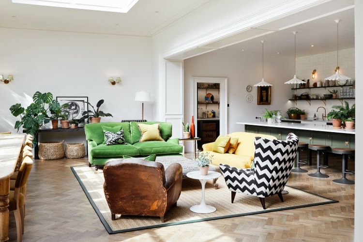
Holbein Chamber™ No.7 W&M Matt (Walls & Woodwork)
Are there any tricks for highlighting beautiful period features, like cornices, skirting boards, or architraves, through paint?
Yes, to truly enhance and celebrate period detailing, consider elevating the contrast between walls and woodwork. This deliberate contrast accentuates architectural features such as ornate cornices, elegant skirting boards, and intricate architraves, drawing the eye to their craftsmanship without overwhelming the space. The approach can be executed with understated neutral palettes, or alternatively, by embracing luxurious, contemporary shades, such as metallic gold for a truly refined aesthetic.
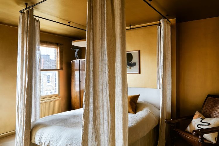
FTT001_(Walls & Ceilings)
Period homes often have unique surfaces and textures. How do you tailor your approach to work with challenging elements, like old woodwork?
While original woodwork that has developed a distinctive patina over time adds to the appeal of period properties, it can also present challenges - think peeling layers, rough textures, and uneven surfaces. You can use our multi-surface Plant-Based paint to tackle this. It’s specifically designed to work with these issues, providing excellent adhesion and a smooth finish that enhances the natural beauty of the wood. We incorporate advanced bio-based resins that are entirely non-toxic, and our signature Marble Matt Emulsion remains highly breathable, a crucial factor in the conservation of period properties. Classic, pigmented colours also help to restore these surfaces by reimagining the woodwork with a modern palette, creating a contemporary style while preserving the authenticity of the space.
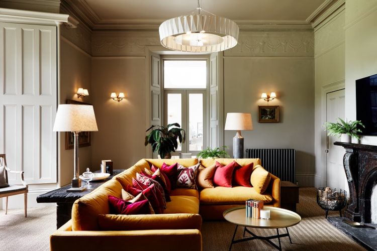
Egyptain Grey™ No.154 W&M Matt (Walls & Woodwork)
Looking to the year ahead, what interior colour trends can we expect to see?
This year, warm neutrals continue to define interiors as homeowners move away from the cooler greys of previous years, opting instead for earthy mid-tones. We have seen many requests for Beata Heuman’s new colour Butter BH. 21, a soft, refined yellow which is certainly emerging as a favourite, and this year it looks like these warm neutrals are becoming the new foundation for restoring and decorating period properties. We have also noticed an increased demand in gold and metallic paints. Often used to highlight a specific feature as a cornice or a door panel, metallic paint can also be used on a full wall, giving a unique warmth to the room.
Thanks so much, Dominic!